
Type Classifications
Most typefaces can be classified into one of four basic groups: those with serifs, those without serifs, scripts and decorative styles. Over the years, typographers and scholars of typography have devised various systems to more definitively categorize typefaces – some of these systems have scores of sub-categories.
A classification system can be helpful in identifying, choosing and combining typefaces. While four categories are clearly inadequate for design professionals, dozens become self-defeating. We have put together a somewhat hybrid system of 15 styles, based on the historical and descriptive nomenclature first published in 1954 as the Vox system – and still widely accepted as a standard today.

Classifications
Serif Type Styles
- Old Style
- Transitional
- Neoclassical & Didone
- Slab
- Clarendon
- Glyphic
Sans Serif Type Styles
- Grotesque
- Square
- Humanistic
- Geometric
Script Type Styles
- Formal
- Casual
- Calligraphic
- Blackletter & Lombardic
Decorative
- Grunge
- Psychedelic
- Graffiti
Serif Type Styles
Old Style
This category includes the first Roman types, originally created between the late 15th and mid 18th centuries, as well as typefaces patterned after those designed in this earlier period. The axis of curved strokes is normally inclined to the left in these designs, so that weight stress is at approximately 8:00 and 2:00 o’clock. The contrast in character stroke weight is not dramatic, and hairlines tend to be on the heavy side. Serifs are almost always bracketed in old style designs and head serifs are often angled. Some versions, like the earlier Venetian old style designs, are distinguished by the diagonal cross stroke of the lowercase e.

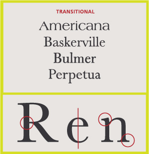
Transitional Serifs
English printer and typographer John Baskerville established this style in the mid 18th century. These typefaces represent the transition between old style and neoclassical designs, and incorporate some characteristics of each. Baskerville’s work with calendered paper and improved printing methods (both developed by him) allowed much finer character strokes to be reproduced and subtler character shapes to be maintained. While the axis of curve strokes can be inclined in transitional designs, the strokes normally have a vertical stress. Weight contrast is more pronounced than in old style designs. Serifs are still bracketed and head serifs are oblique.
Neoclassical & Didone Serifs
These are typefaces created within the late 18th century, or their direct descendants. The work of Giambattista Bodoni epitomizes this style of type. When first released, these typefaces were called “classical” designs. Early on, however, it became apparent to printers that these were not updated versions of classic type styles, but altogether new designs. As a result their classification name was changed to “modern.” Since the mid 20th century, they have also been classified as neoclassical or didone. Contrast between thick and thin strokes is abrupt and dramatic. The axis of curved strokes is vertical, with little or no bracketing. In many cases, stroke terminals are “ball” shapes rather than an evocation of a broad pen effect. These tend to be highly mannered designs, with clearly constructed letters.

Slab Serifs
Slab serif typefaces became popular in the 19th century for advertising display. These typefaces have very heavy serifs with minimal or no bracketing. Generally, changes in stroke weight are imperceptible. To many readers, slab serif type styles look like sans serif designs with the simple addition of heavy (stroke weight) serifs.

Clarendon Serifs
This category includes the typefaces patterned after the Clarendon type styles first released in the mid 19th century. Clarendons were designed as bold faces to accompany text composition. Their stroke contrast is slight, and serifs tend to be short to medium length. Later, many of these designs were released at larger point sizes as display types. Character stroke weight that is more obvious, and serifs that tend to be longer than earlier designs, mark more current interpretations of this style.

Glyphic Serifs
Typefaces in this category tend to emulate lapidary inscriptions rather than pen-drawn text. Contrast in stroke weight is usually at a minimum, and the axis of curved strokes tends to be vertical. The distinguishing feature of these typefaces is the triangular-shaped serif design, or a flaring of the character strokes where they terminate. In some type classification systems this category is sub-divided into two groups: “glyphic” and “latin.” “Latins” are faces with strictly triangular-shaped serifs.

Sans Serif Type Styles
Grotesque Sans Serif
These are the first commercially popular sans serif typefaces. Contrast in stroke weight is most apparent in these styles, there is a slight “squared” quality to many of the curves, and several designs have the “bowl and loop” lowercase g common to Roman types. In some cases the R has a curled leg, and the G usually has a spur. This category also includes more modern, sans serif designs patterned after the first grotesques. Stroke contrast is less pronounced than earlier designs, and much of the “squareness” in curved strokes has been rounded. Normally the most obvious distinguishing characteristic of these faces is their single bowl g and more monotone weight stress.

Square Sans Serif
These designs are generally based on grotesque character traits and proportions, but have a definite and, in some instances, dramatic squaring of normally curved strokes. They usually have more latitude in character spacing than their sans serif cousins, and tend to be limited to display designs.

Geometric Sans Serif
Simple geometric shapes influence the construction of these typefaces. Strokes have the appearance of being strict monolines and character shapes are made up of geometric forms. Geometric sans tend to be less readable than grotesques.

Humanistic Sans Serif
These are based on the proportions of Roman inscriptional letters. Frequently, contrast in stroke weight is readily apparent. Typographic experts claim that these are the most legible and most easily read of the sans serif typefaces. Humanistic sans serif typefaces also closely match the design characteristics and proportions of serif types, often with a strong calligraphic influence.

Script Type Styles
Formal Scripts
These typefaces are derived from 17th century formal writing styles. Many characters have strokes that join them to other letters.

Calligraphic Scripts
These scripts mimic calligraphic writing. They can be connecting or non-connecting in design. Many appear to have been written with a flat-tipped writing instrument.

Blackletter & Lombardic Scripts
These typefaces are patterned on manuscript lettering prior to the invention of movable type.

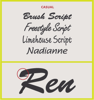
Casual Scripts
These typefaces are designed to suggest informality, as if they were written quickly. Many times they appear to have been drawn with a brush. Normally, character strokes connect one letter to the next.
Decorative Styles
This is the largest category and also the most diverse. Rarely used for lengthy blocks of text, decorative typefaces are popular for signage, headlines and similar situations were a strong typographic statement is desired. They frequently reflect an aspect of culture – such as tattoos or graffiti – or evoke a particular state of mind, time period or theme. Many – such as psychedelic or grunge designs – are time-sensitive and fall out of fashion. Some decorative typefaces use unorthodox letter shapes and proportions to achieve distinctive and dramatic results. Some even appear three-dimensional.
